New Brand Launch
As a creative agency, we love seeing brands come to life from concept to completed project. When we were presented the opportunity to work with an insurance group with a new brand identity, staring from the ground up, we couldn’t have been more excited. The first part of our rebranding process was where every strong brand starts, the name. When dealing with an insurance group, no one wants to do business with a company whose brand does not signify strength, integrity, or some sense of security. The new brand had to reflect that. I don’t know about you, but I wouldn’t put my money into or hold a great sense of security in a company called; Fluffy Bunny Insurance, I mean maybe they are good at what they do, but fluffy bunnies don’t make me feel safe OR secure.
When we started brainstorming, our thoughts immediately went to the concept of protection, assurance, and peace of mind, which is really the only reason people buy insurance, isn’t it? We toyed with several names before narrowing the list and presenting to the client. In the end, we landed on a name that to us, and the client, hit on all aspects of what a good insurance company should be; Strong, Secure, and Safe. Fortify Insurance Group was born.
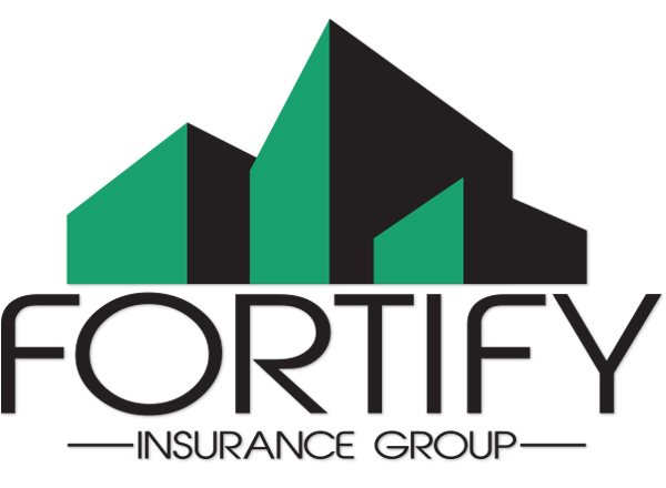
With the name in place we took to the drawing board which brought forth dozens of doodles of shields, castles, and armor-clad typography ready to do battle at the gates of Life Insurance Tower. In the end, what we ended up with was a great departure from medieval times. The clean lines and simplicity of design in the new mark accented what the name was already saying without overpowering it. A modern spin on a name that conjured up ancient days of knights and castles. The three shapes are abstract and ambiguous enough to leave it somewhat up to the interpretation of the viewer. Are they buildings? Part of a gate? An old mystical temple holding great treasures? That’s up to you.
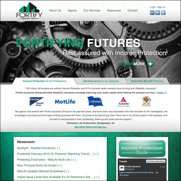
When it came time to design the website we wanted a clean and modern approach to not only accompany the new brand, but to set Fortify Insurance Group apart from the sea of poorly designed insurance websites that fill the world wide web. Any time you have a web project in the business realm, you walk a fine line of being artistic while professional, without becoming unnecessarily artsy and over-designed. We wanted something unique and different, but not so far left field that an insurance agent would be baffled as to what kind of website they had landed on upon arrival. To start, we established a simple color scheme, sticking to black, white and grey, with green being the only other dominant color in the design. Even the use of photos on the homepage were stripped of color to not only highlight the bold green, but to emphasize the professionalism of the website and company.
We are very excited about this new website and branding launch and hope you like the new look!
To learn more, visit: fortifyinsurance.com and check out our latest work.
Categories